Development Design Guide
Overview
BigBlueButton is an open source web conferencing system for online learning. Our goal is to provide remote students a high-quality online learning experience.
One measurement of how well we achieve that goal is to ask "how easy is for a user, after a few moments of interaction, to master the interface and get on with the task of teaching or learning?
We think a good interface is critical to the success of any product. This document gives you an overview of design decisions we made in creating a consistent interface for the HTML5 client that spans use on mobile, tablet, and desktop platforms.
Design Goals
User expectations
Today, users expects applications -- especially mobile applications -- to have a similar user interface. As a result, similar applications have evolved to have similar interfaces.
In a web conferencing application, uses have common exceptions on sharing their webcam, microphone, and screen.
When designing the BigBlueButton client, we didn't feel the need to create any radically new ways of interaction on a mobile and desktop client; rather, we wanted to provide users with a modern and accessible interface that would be familiar to all based on their prior experience with other applications.
Mobile first approach
Designing for mobile first allows us to take a step back from the current user experience and think about the minimal set of features required for a user to engage in an online session (you will see lots of screen shots of this designs below).
The current Flash-based user experience has a series of windows and layouts to accommodate different users. However, a mobile application doesn't have windows. Instead, it a core set of elements that intelligently overlay as the user needs to access them.
We have a similar set of elements in BigBlueButton
- The presentation area
- Group or private chat
- Participants list
- Video (webcam and desktop sharing)
- Preferences
Unified experience
Providing a unified experience will allow our users to quickly become familiar with the product and reduce the overall learning curve. If you are using the web, tablet or mobile client, our goal is to have consistent styles and placement of elements. By doing so, will also make the experience of contributing or building on top of BigBlueButton a lot easier for developers.
Consistent across platforms
While the initial design of the HTML5 client focused mainly on the mobile experience, we want the HTML5 client to run on the desktop as well. The Flash run-time environment has enabled us to provide BigBlueButton across Mac, Linux, and PC computers. We expect, over time as the HTML5 client matures, it will become the default interface across all platforms.
Mobile has different user experience from a web application. After all, they are different forms of interaction: touch vs. mouse, handheld vs. screen, tap vs. keyboard. Over time, we evolved the designs to include interaction on the desktop. We expect as the HTML5 client matures it will become the default interface across all platforms.
Accessibility
Accessibility is very important to our target market of online learning. We wanted to make sure the designs would allow us to provide our users with a variety of accessibility best practices, such as Aria landmarks, Aria labels, Aria polite and providing a colour palette that supports visually impaired users. While Flash has very good support for accessibility within the web browser, we wanted to be sure the HTML5 client was equally accessible as well.
Extensible UI design
BigBlueButton is not only a solution, but a platform that other companies build upon. In creating a new design one of our goals is to provide our community with a modular design so that new features or components can be created with ease. If a developer wanted to add a shared notes module in the UI, for example, or additional volume controls, we want to make sure the look and feel are consistent with the existing user interface.
Shareable Design Document
With the latest design of our HTML5 client, we're including a shareable design document for other designers to use as a starting point to brand the client or to conceptualize new features.
Download BigBlueButton Design Sketch App File
Client Designs | Initial Release
Below are designs for our first release for the web, tablet and mobile HTML5 client.
Mobile Views
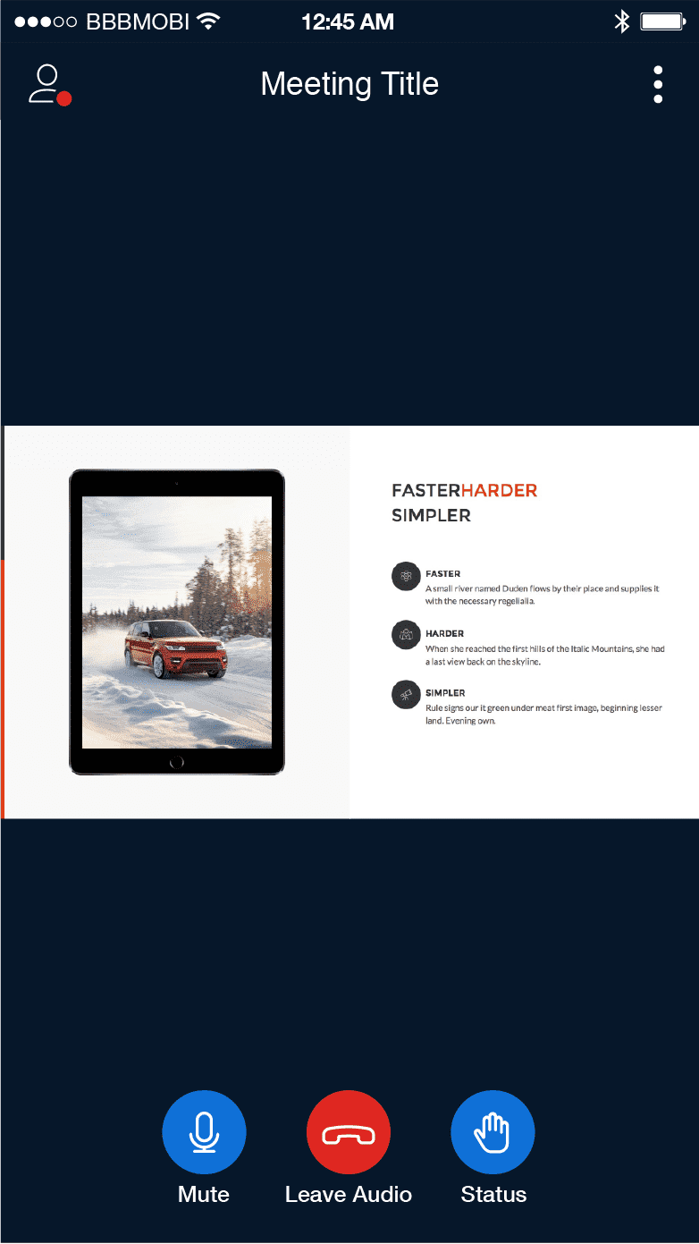
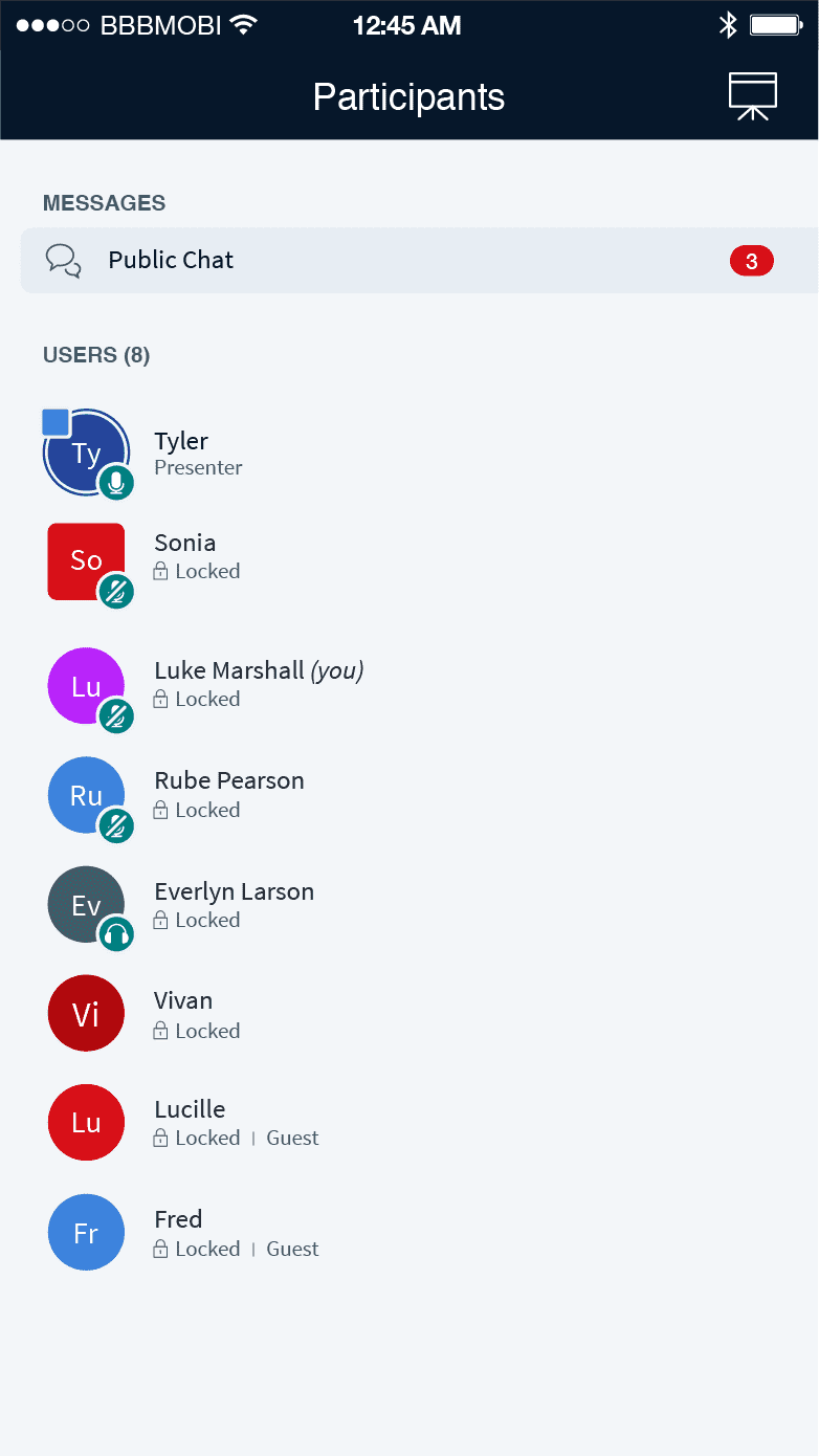
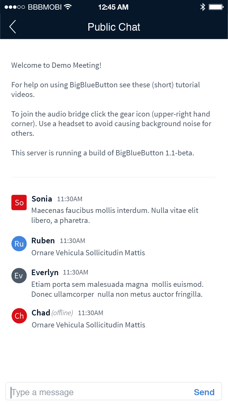
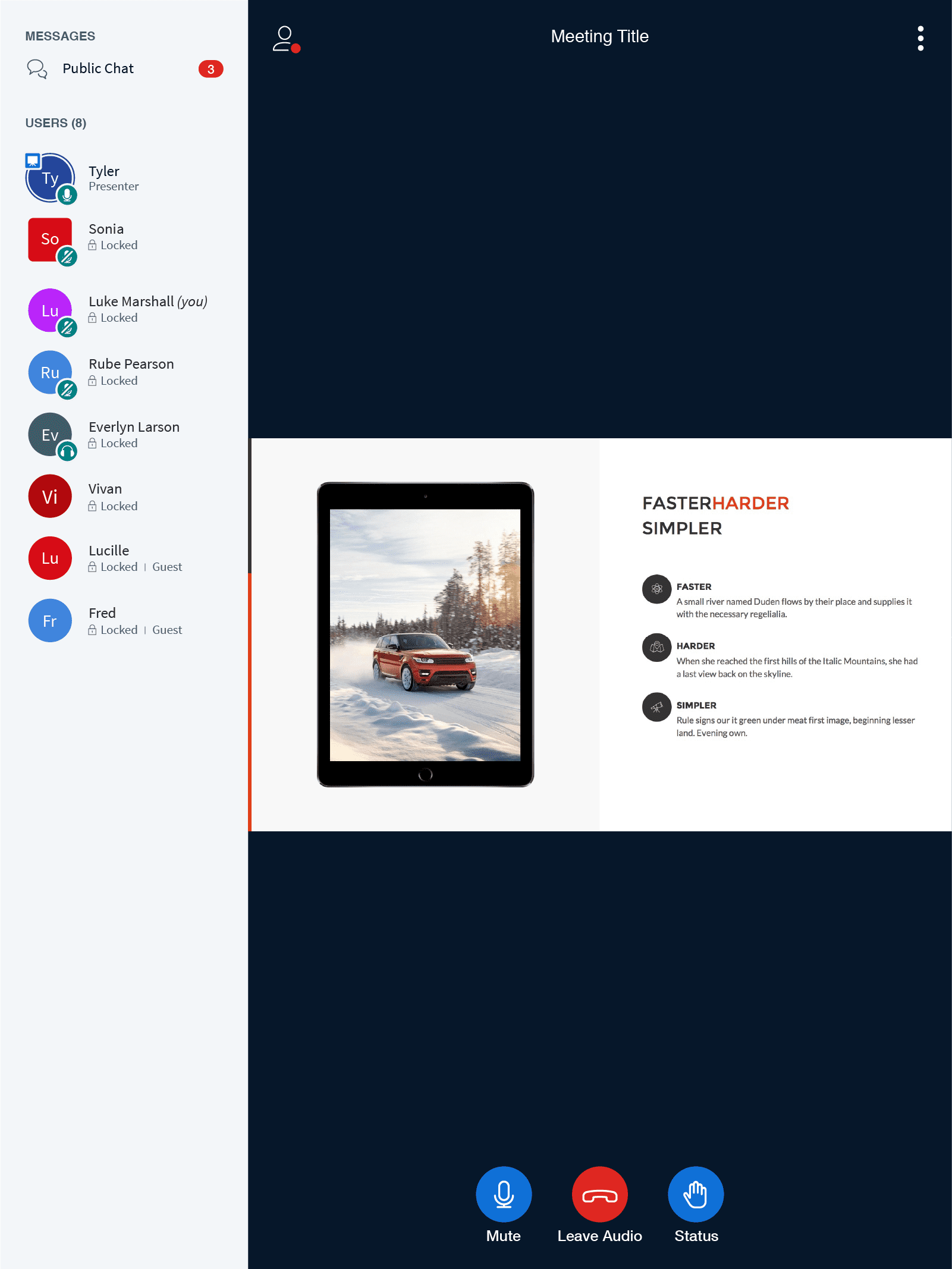
With the first release of the HTML5 mobile Views, we've focused our efforts on building the viewer functionality. This includes, consuming the presentation, enabling/disabling your audio, emoji interactions, as well as the ability to participate in public/private chat conversations.
Tablet Views
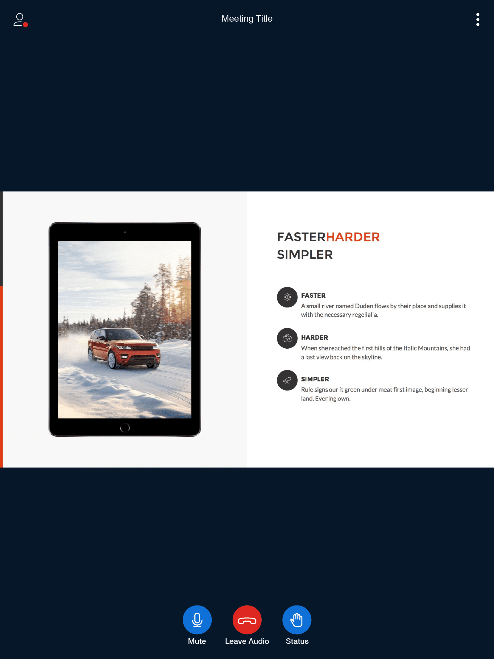
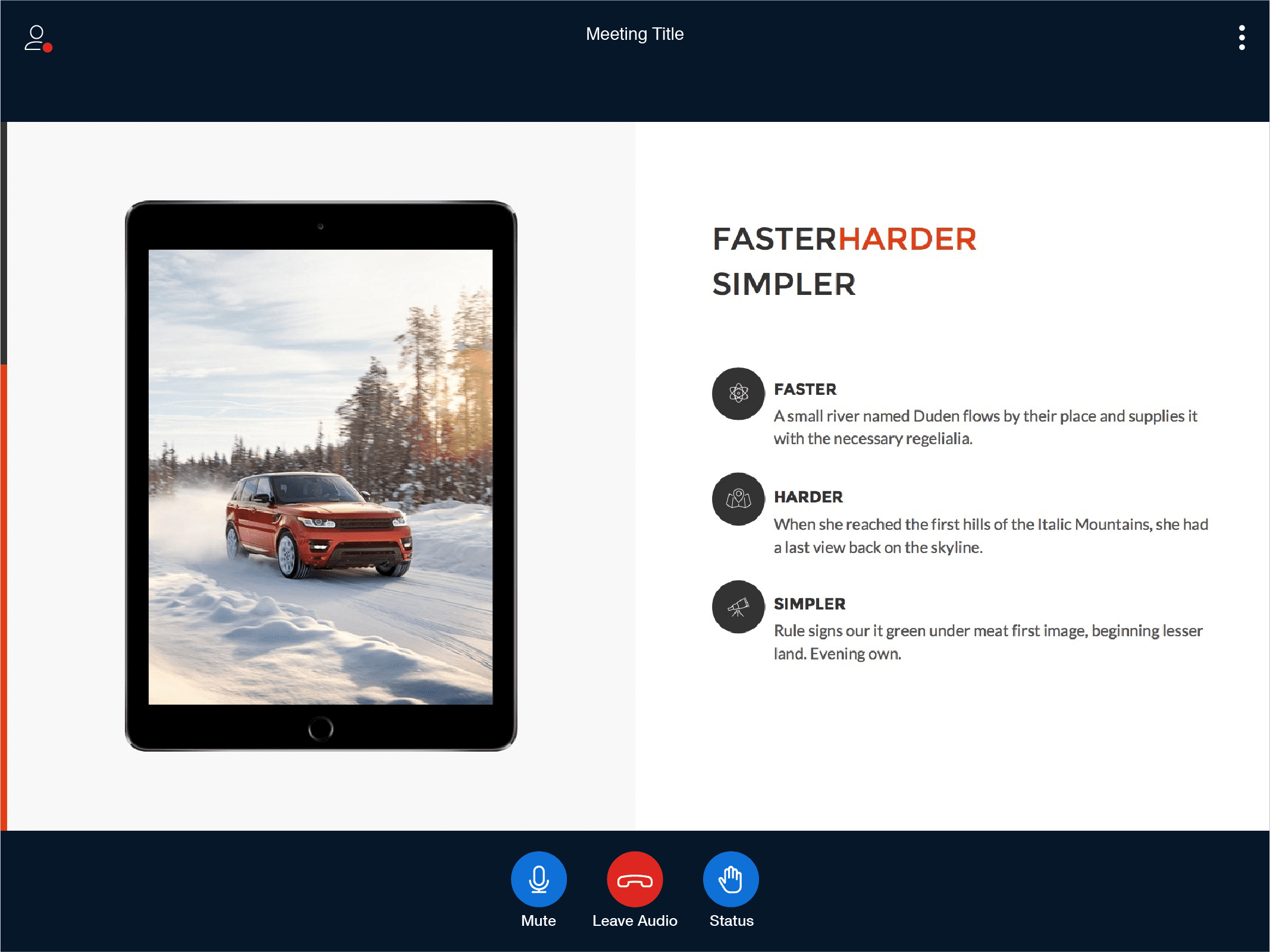
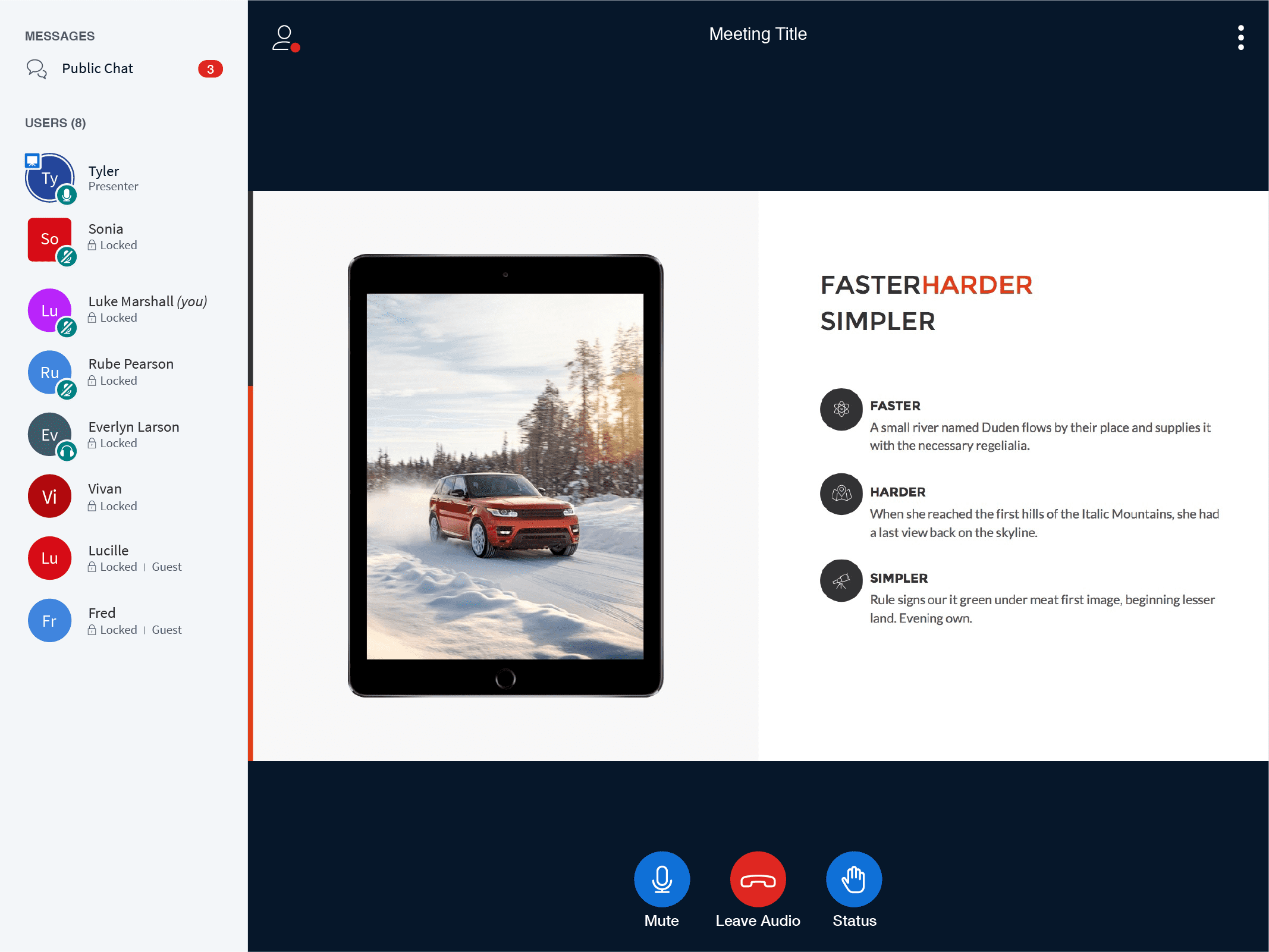
The tablet views follow the same design pattern as the mobile phone.
Desktop Views
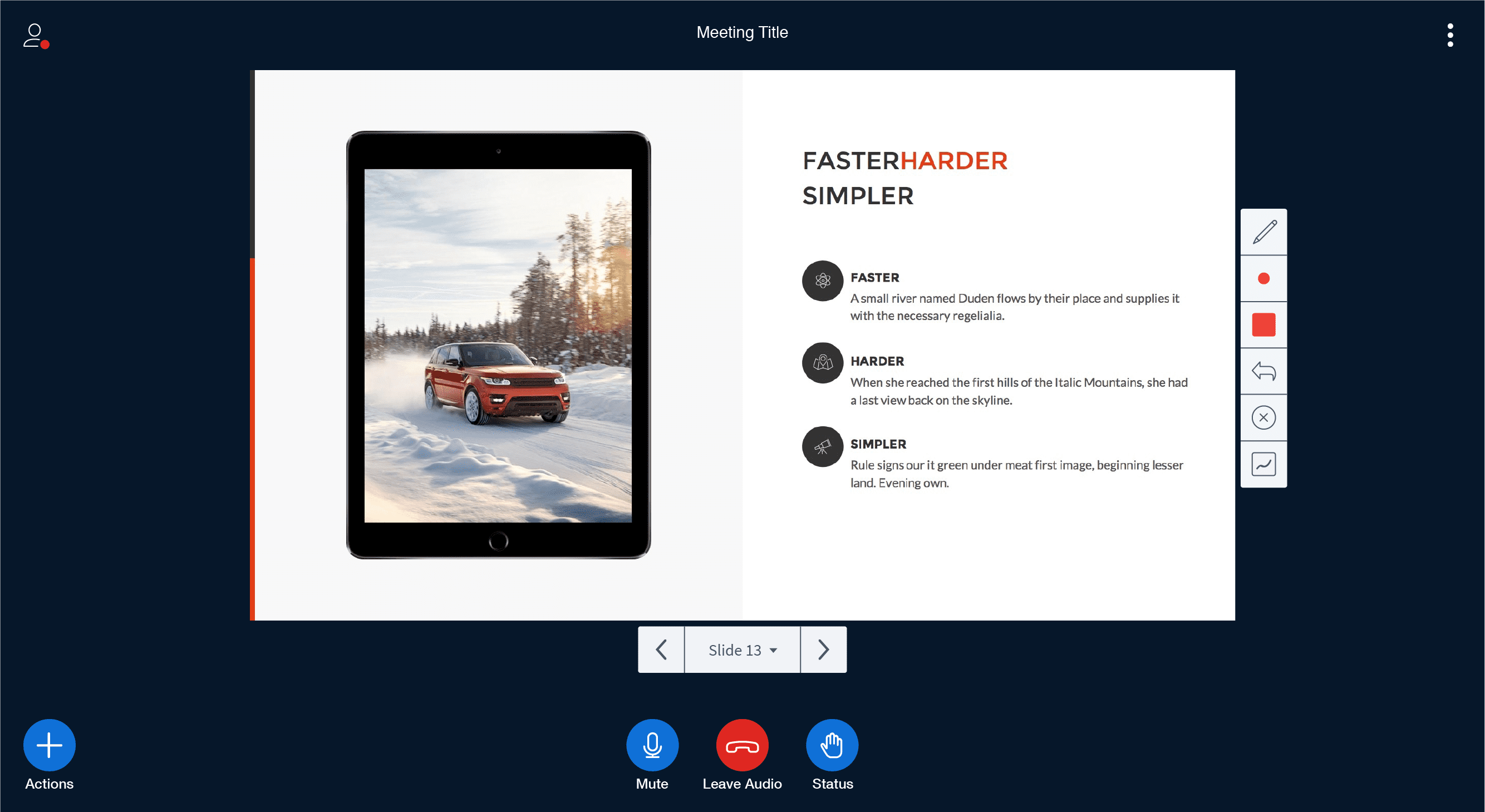
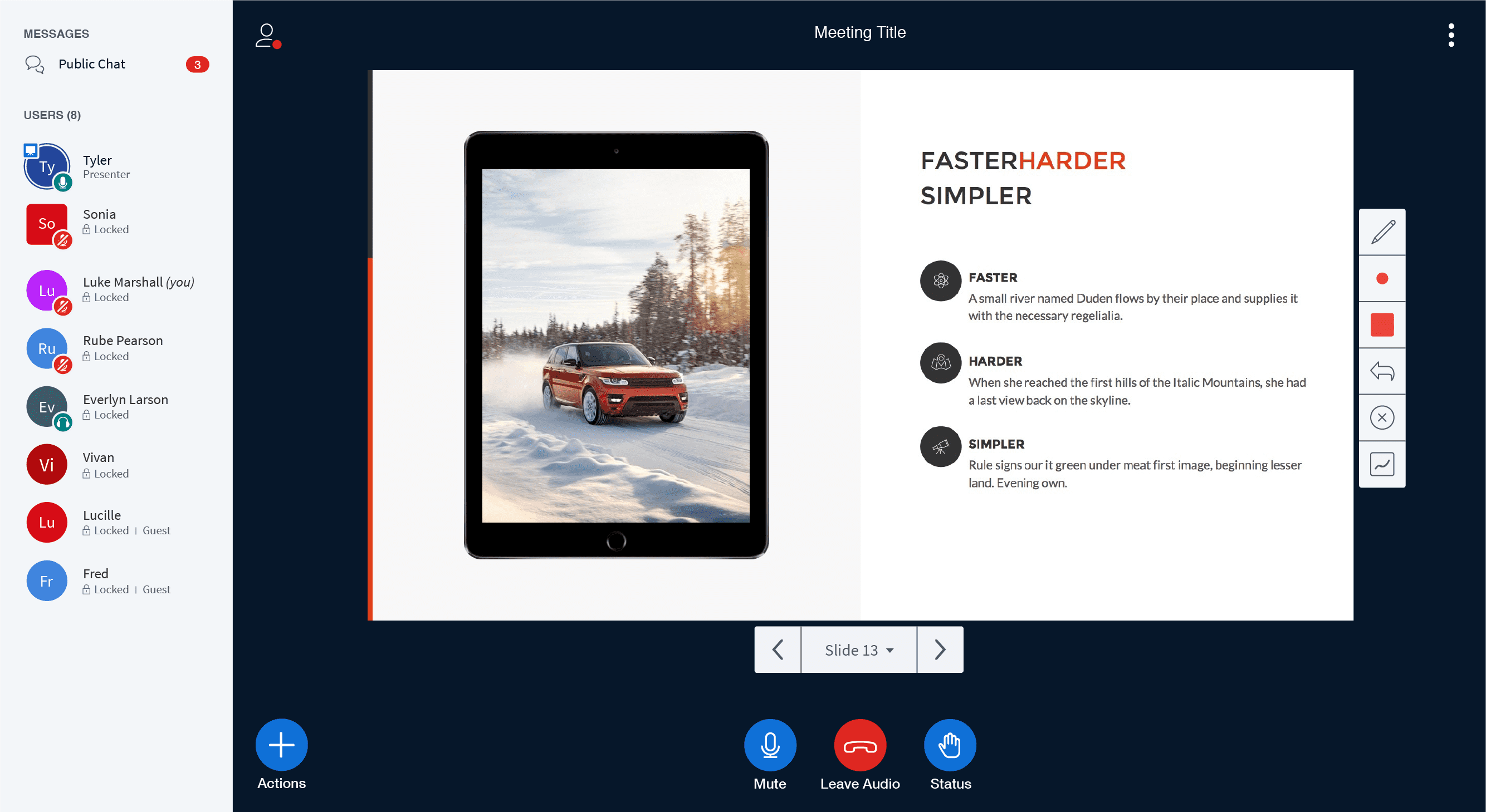
For the desktop experience, it's where we start to see more of the functionality become present to presenters and participants. Here you will see (as a presenter) the ability to upload slides, annotations, multi whiteboard and closed captioning.
Default View
Expanded Sidebar View | Public & direct messages and the list of participants.
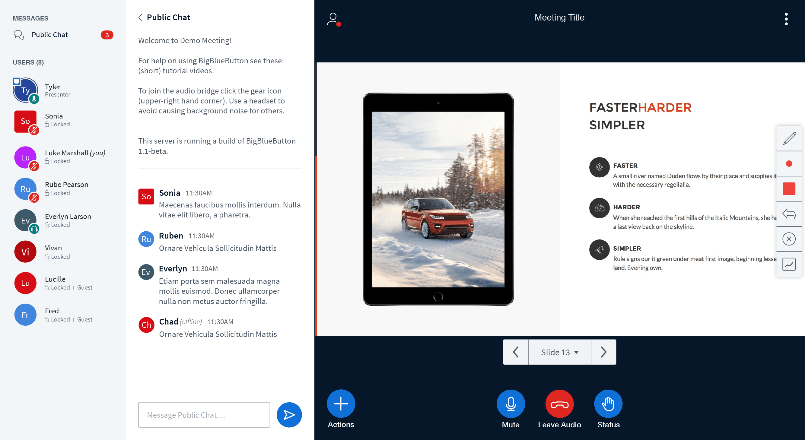
Full Expanded View | Public and private chat.
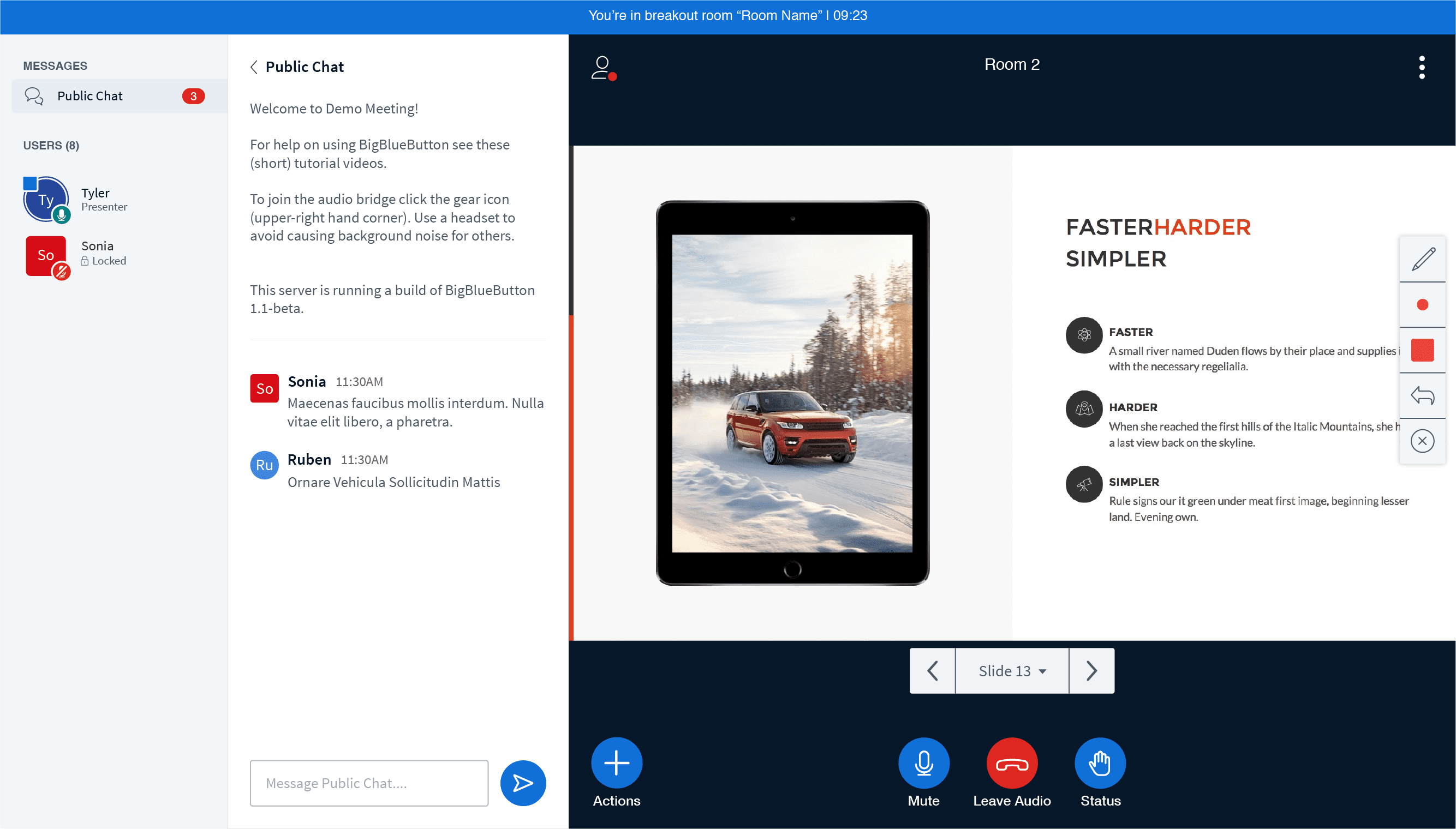
Breakout Rooms
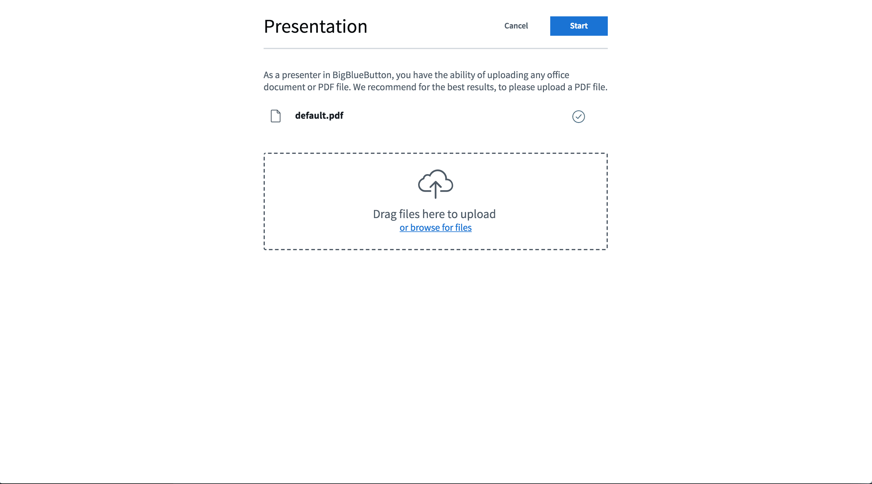
Uploading a presentation
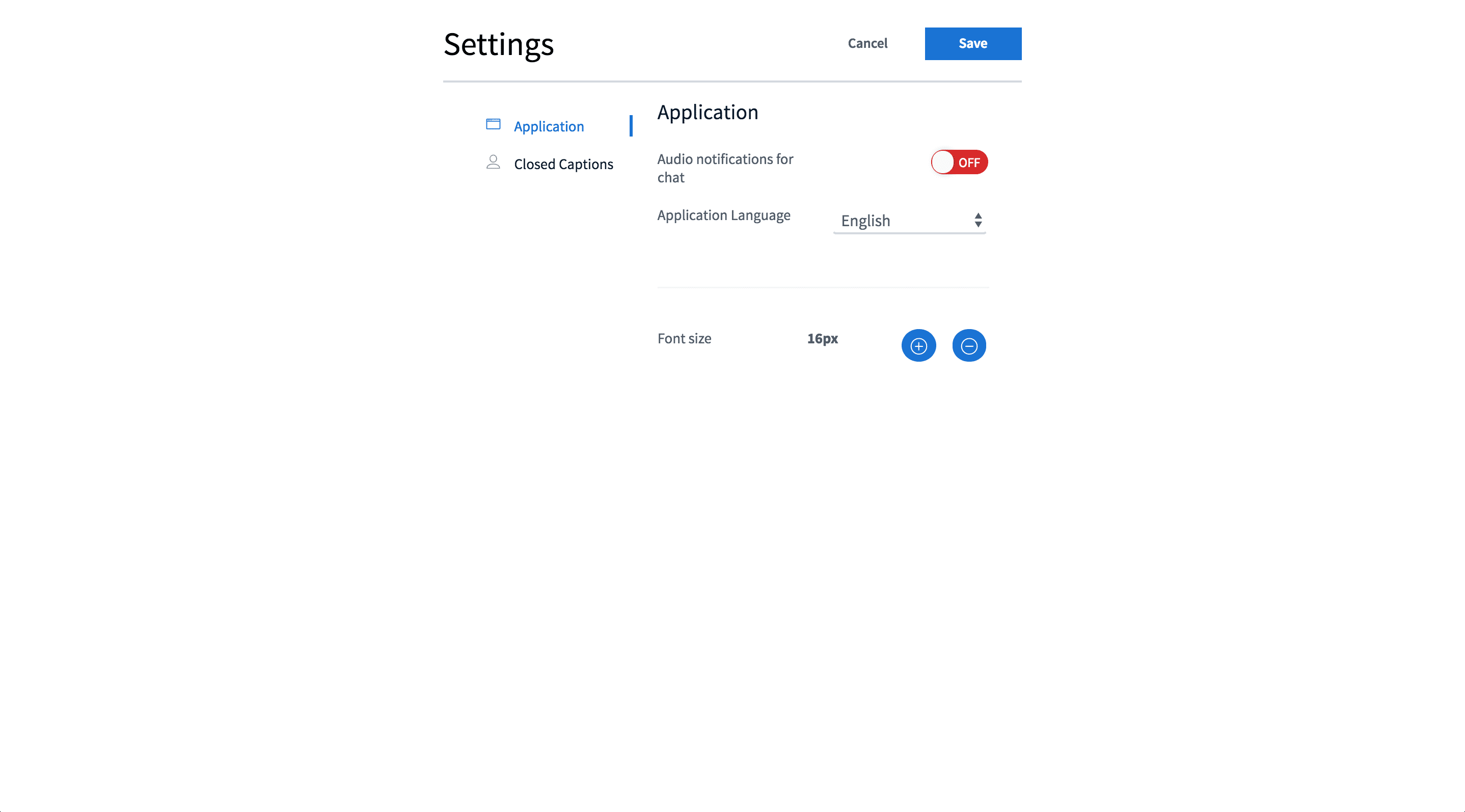
User Settings
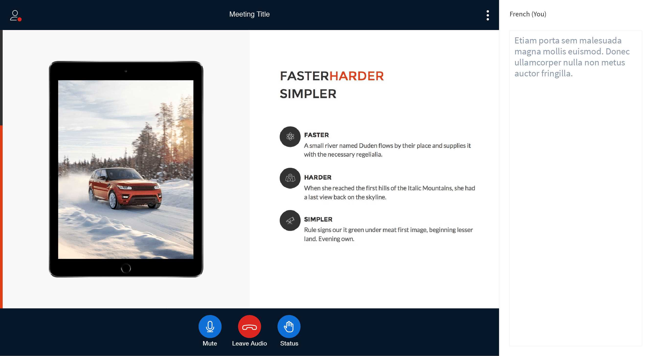
Closed Caption
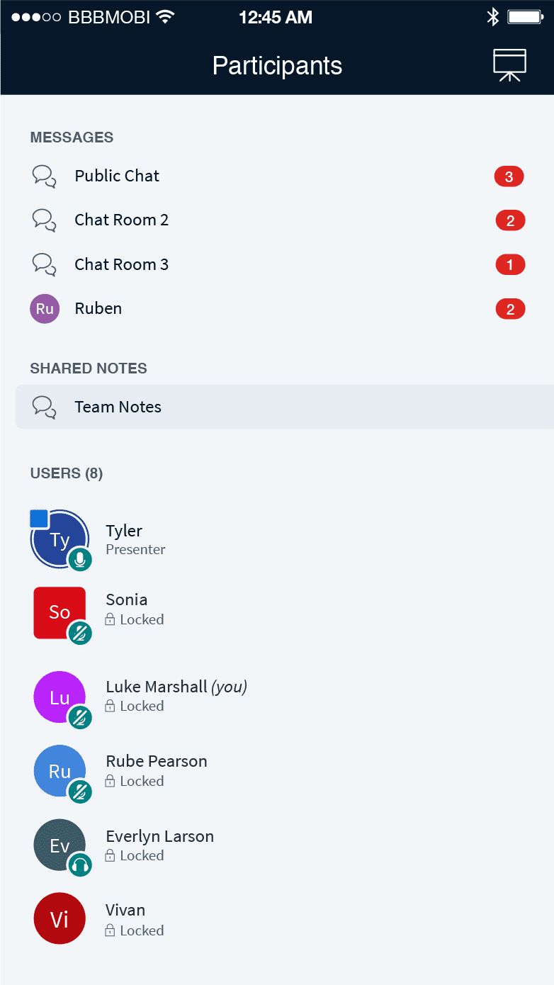
Participant types
Presenter: As shown above, the blue square in the top left-hand corner of the avatar indicates that the participant is the presenter. Located in the bottom right-hand corner is the join audio indicator (audio icon + green circle) and the ring around the avatar visually represents that someone is speaking.
Moderator: We wanted to visually differentiate moderators from all other participants and have done so by visually changing the avatar to a square. With the state displayed above, you will also see the moderator has their audio muted (muted icon + red circle).
Participant: Participates are visually indicated using a circle avatar, and In the case displayed above, this participant has selected to join the audio listen only (headset icon + green circle).
Style Guide
Overview
In the style guide displayed below, you will find a breakdown of the core colour palette, typography and elements styles used in the HTML5 client.
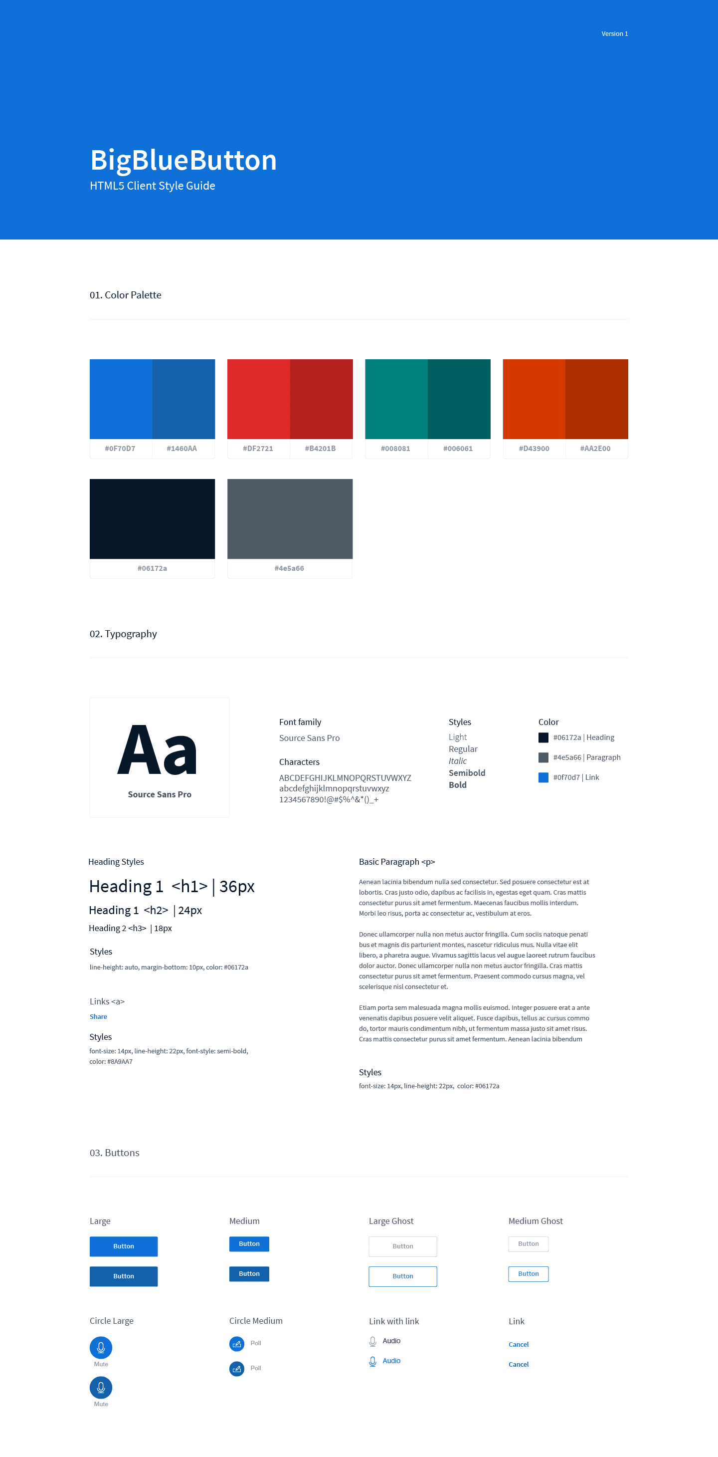
Accessible Colour Palette
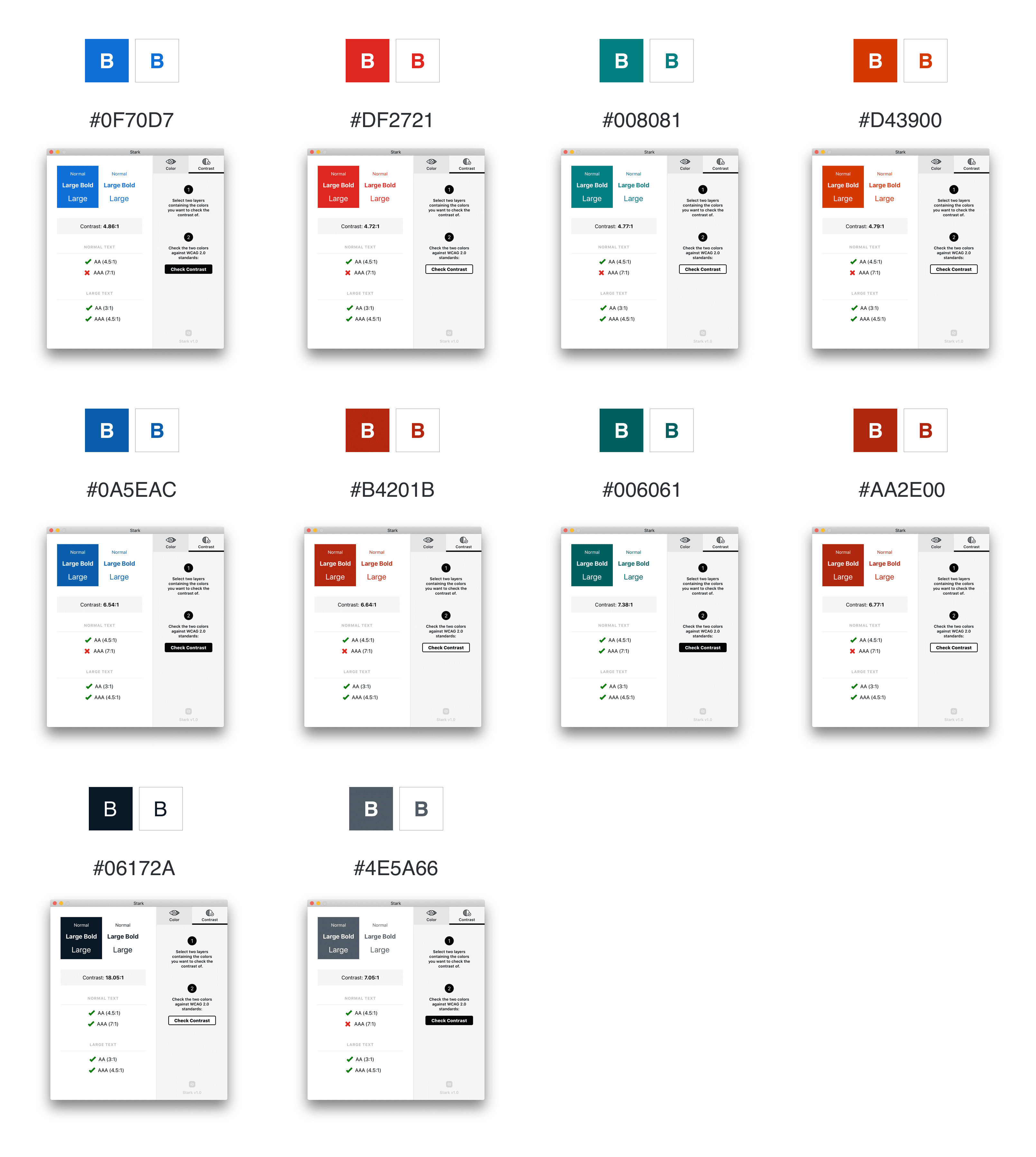
As a team, we're passionate about maintaining accessibility best practices within our products, and in the case of colour, we want to make sure all types of users (visually impaired or not) have a pleasant experience. Below you'll find a detailed overview of our core colour palette and their contrast ratio. Our goal was to maintain a ratio of 4.5:1 an above.
Custom Icon Library
With the new HTML5 client, we wanted to include a shareable icon library that developers could use during development and have created our own custom icon library with over 80+ icons.
![]()
Client Designs | Planned Updates
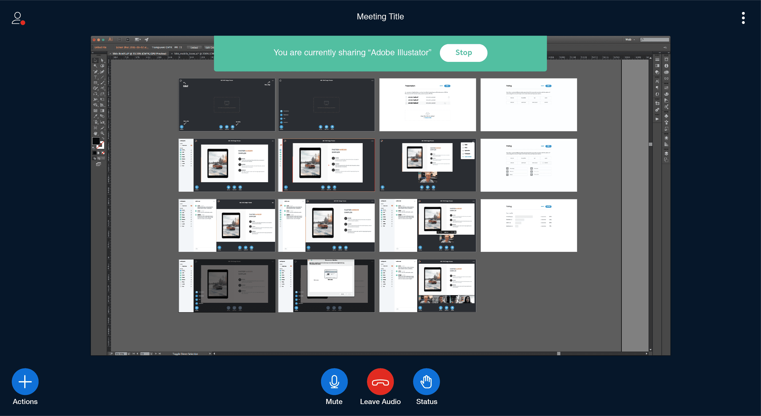
Desktop Sharing
When a presenter chooses to share their desktop, it will replace the existing presentation area. At any time, the presenter can end their desk share, and the presentation will resume in its original location.
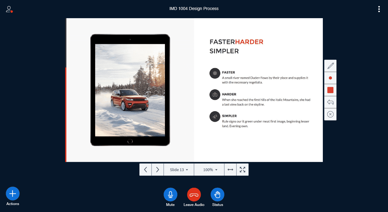
Expanding the presentation controls
Updated presentation controls to be included are, zoom, fit to width and fit to page.
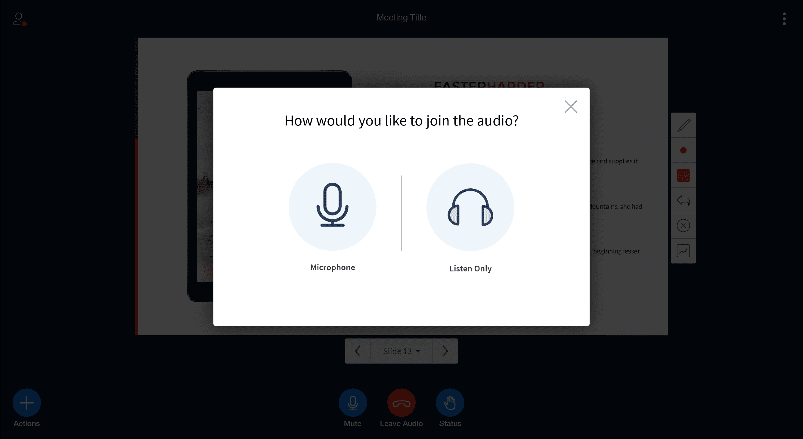
Audio dialog with echo test
When a user joins a session, a dialogue box will appear signifying which auto route they can take, joining audio using a microphone or listen only (similar to the flash experience). If they select join via a microphone, a user will be prompted with another step asking if they can hear themselves (echo test). From there, if selected "Yes", then they will advance into the session.
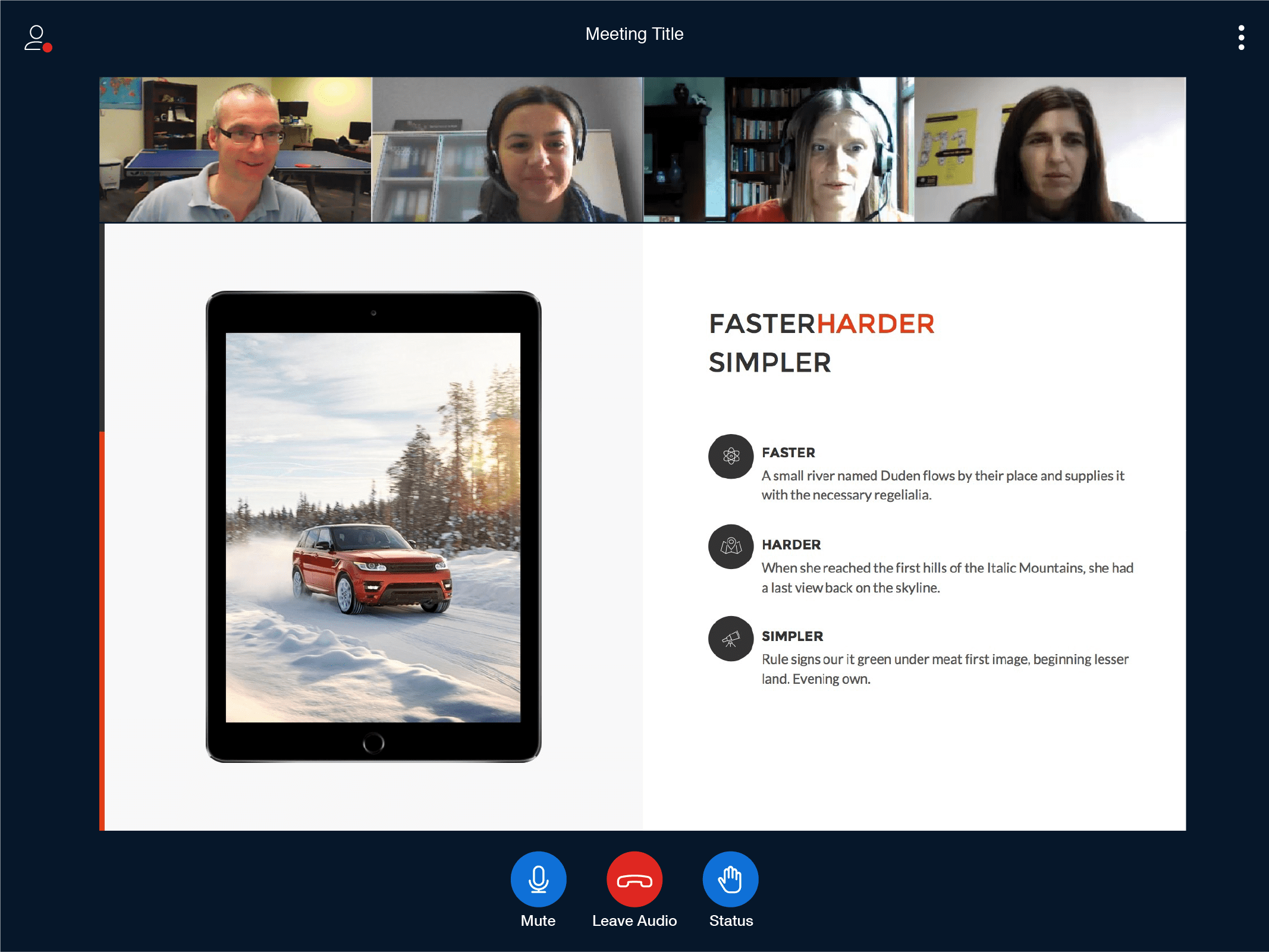
Client Designs | Roadmap Features
Video Sharing
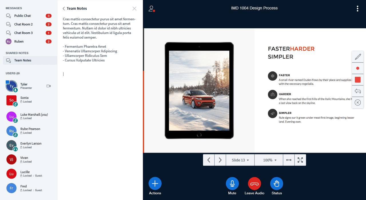
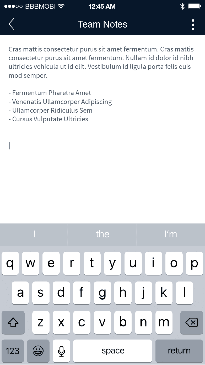
Shared Notes
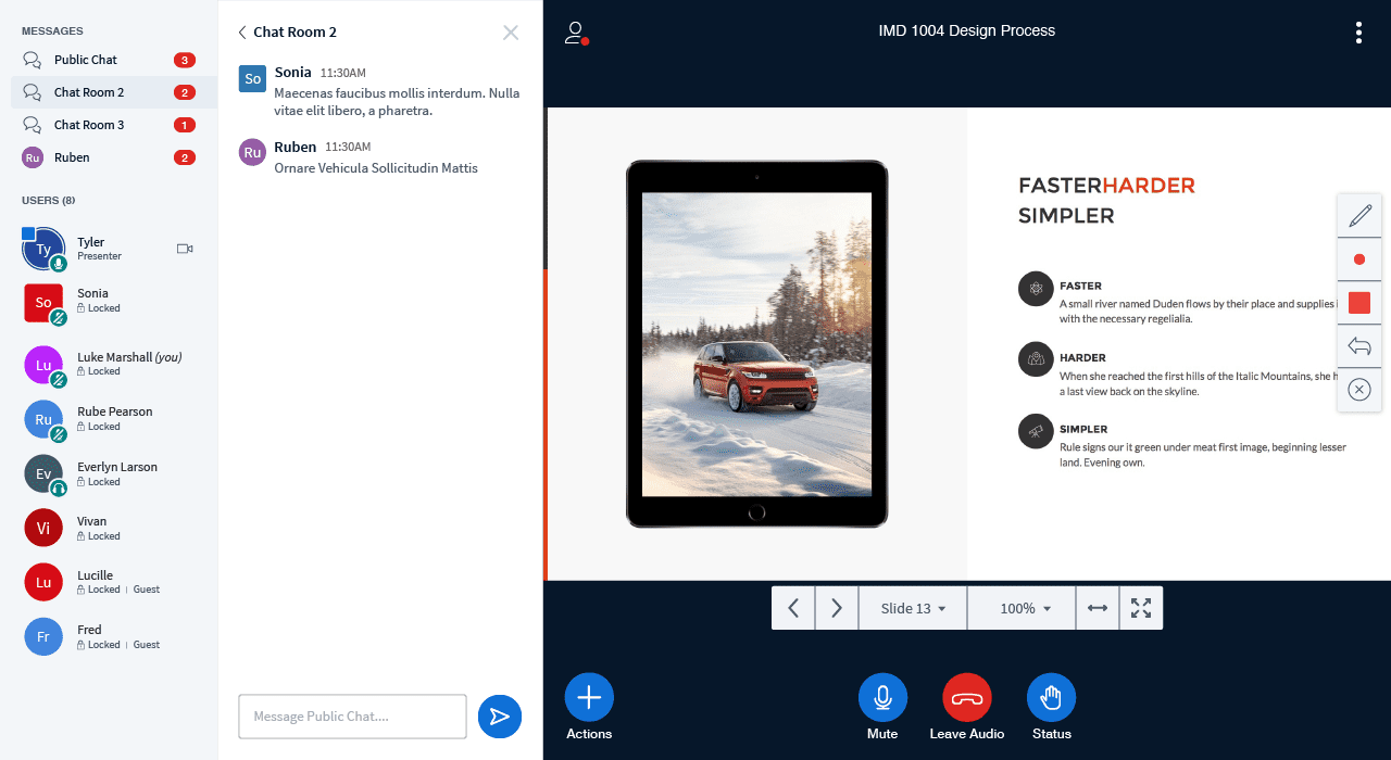
Multiple Chat Rooms

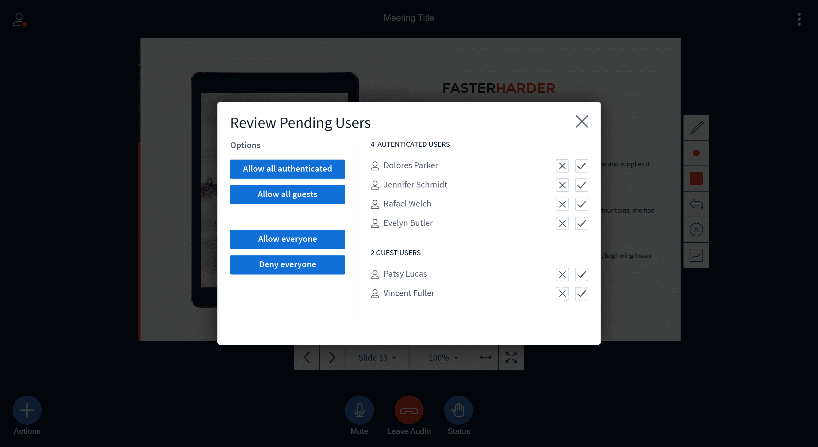
User Management
If you have any questions or feedback, please join the BigBlueButton community and post them to the bigbluebutton-dev mailing list. We look forward to hearing from you.